top of page
Kimberly Jade McDonald
Doctor Strange Perspective

Research
Charcoal Architectural Study
The study was a challenge, but once I finally buckled down and started working on the final study, I realized the beauty and structure charcoal could give. I'm a lover of high contrast, so despite the slow start, once I pulled out the condensed charcoal I fell in love with the effect. If a mistake happened, you should still erase with ease, re-define and conquer!
Gathering Photos for Reference
Growing up, I have traveled all over the states, and something that I have learned is the power of photos, and how they help me remember my experiences. I've always wanted to use these photos from an excursion in downtown Dallas.
Sketches and Ideas

Doctor Strange Movie Studies
Something I noticed right off the bat once I began doing studies of the movie, was that I was intrigued more so by the magic aspect of Doctor Strange than the actual physical movement of the buildings.
Process
Idea 1
Idea 1 was immediately scrapped.
Idea 2
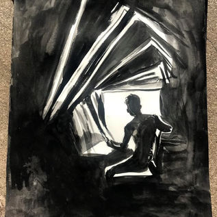
As a lover of characters and stories, I couldn't help but come up with the idea of a symbolic narrative. The fact that I had photos of the church in Dallas gave me the impression of a holy representation of my character by using an implied halo that would serve as this piece's main light source.
Composite Studies
Full Value Studies
Final Drawing Process
Final Graphite Drawing

Scanning Process
After I completed the graphite drawing, I scanned it using a large EPSON scanner, then colored it digitally using the program Clip Studio.
Color
Materials
-C0nte Crayon
-Reeves drawing paper
-Paintbrushes
Achromatic

For the achromatic still life, I used brown and black. With this being my first time using this medium, I started with a bit of caution. I wanted to create a simple still life; and something about the way the swan overlapped the vase behind it intrigued me. I used both the drawing and painting technique by layering on the colored values and then using water to spread the color.
Monochromatic

For this segment of the project, I was getting a hang of the Crayons. Whenever doing the monochromatic piece, I saw lots of people reaching for reds or greens, some even blues-- and I got a little tired of the color. Purple isn't my favorite color to any degree, but I really wanted to try it out. I experimented with leaving the piece relatively unfinished, focusing solely on my focal point, the shoe and the metal's reflection on the shoe.
Complimentary Colors


In this assignment, I used the complimentary colors blue and orange. However, a problem I faced was that the orange came out yellow, turning the blue green instead of a darker shade of blue/ darker shade of yellow. To solve this, I used blacks to help neutralize the blues and reds to help keep the orange to remain looking orange.

In the end, I also wanted to develop the style of "finishing" a piece by also keeping some of the raw edges of my drawing showing through. I feel like keeping some of it drawing and some painting becomes a sort of visual tutorial; giving a little insight in how I accomplish a piece.
Full Palette


During this process, a full palette brought in it's' own unique challenges, such as cohesiveness throughout the piece. I started off by using just bright colors for my focal point, the flower, and only used it's complimentary, green, for the darkest darks. This way, I could keep the color as clean and bright as possible. Everywhere else, however, I wanted to dull, if at least a little. I used blacks, complimentary, and analogous colors to achieve different levels of brightness and dullness in my hues.
detail shots


This investigation of color has helped me to approach pieces of artwork and consider it's effect on a piece as a whole.
Figure Drawing
Day 1 (portrait)
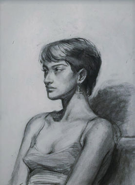
Figure drawing is something I've been wanting to do for a long time, but wasn't ever able to because of my age. Obviously, I'm old enough now, so I was excited for my first experience in figure drawing. My first ever 20-minute session (left) was me trying my best to replicate the figure before me. I began drawing by just pure observation,not focusing on the tiny details. I used vine charcoal to give blurred edges along the face and left shoulder. My second 20-minute session (right) was distinctly not as successful as the first, because I focused more on her features. This later helped me figure out her specific/unique features in the 1 hour session.
In the first 1 hour session, I combined the technique of forming the shapes and form in first 20 minute and using the actual forms of the facial features done in the second 20 minute.
Day 2 (Portrait)
The second day of live portraits was weaker than my first. A couple of major mistakes occurred whenever I tried to focus more on the details rather than the overall form. The second major mistake occurred when I drew my 1 hour pose too small for the amount of detail I was trying to achieve.
Day 3: Full Figure
As this is my first time doing the full figure, I was excited. I used a mix of blurred lines, as well as line weight to help show the shadows that are going on in the figure. My first two 10 minute poses (left) were more successful than my third 10 minute pose (right), because the proportions in the first two were more accurate than the third.
My first 20 min figure, I used expressive lines as well as contour to help represent the clothes chair the model sat on.
Day 4: Full Figure
The first two 10 minute poses were quick, and I focused primarily on form and proportions than anything else.
My first 20 pose ended up resembling my first two 10 minute poses, mainly because of the more intricate pose and lighting.
In my final 1 hour, I spent a lot of time with form; but after a while began to focus a little too much on detail; something I considered for the last final pose.
Day 5: Long Pose
The first day of our long figure pose, I was extremely sick and struggled a lot during this session. So, we are going to brush this figure and this pose under the rug and pretend it never happened.
Day 6: Long Pose (Continued)

This is more like it! I restarted the figure and began anew. I approached this figure more subtly; goodbye contour and goodbye expressive lines. I was determined to show the model more realistically while keeping my own style.
Self Portrait
Heading 2
Inspiration
Soey Milk
For the longest time, I have been following Soey on Instagram, and have been in love with her use of textures and color. All throughout my self-portrait, Soey's work popped into mind. I wanted to play around with finished/unfinished aspects of my painting as well as textures.
Materials
Toned Premium - Gessoed Hardboard
Cheap acrylic store paint and detail brushes
Process
For idealizing my self-portrait, no preparatory sketches were made. I drew directly onto the hardboard and played with composition. I wanted to use acrylic for two main reasons; one being that I wanted to practice the medium more and two, to recreate two acrylic self-portraits I had previously made. I started off by blocking out colors and shadows to make under layer of color. I then began painting the values on top of said layer.
Finale
bottom of page


